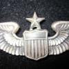
mtnman Posted February 18, 2020 Share #1 Posted February 18, 2020 I have a deep affinity for the wings manufactured in the early years just after the changes made in 1919 and 1920 regarding the insignia of pilots, observers etc. During that period of time, from 1919 to the later twenties, the number of Pilots and commissioned officers in the air service and then the Air corps dropped off dramatically! By 1927, on July 1st, there were only 919 commissioned officers in the Air Corps! Compare that to the thousands upon thousands during World War I and the hundreds of thousands of airmen in World War II. It is actually a rare and outstanding find when you can peg a pilot wing to the 1920s as our Air Service and then Air Corps was beaten down by scarcity of funds and attention given it by Congress. Not only interesting about that time is that the wings themselves are rare and it is a great discernment skill to be able to identify the key elements of the 1920s manufactured wings, one must consider what was done during that time as well. The 1920s were a time of barrier-breaking and great leaps in Aerial technology both tested and applied Air Service and later the Air corps by the few airman within the ranks. New frontier of exploration and warfare was a paradigm of great discovery during this time and it is fascinating to have the wings of these men who were a part of it! I did not see the mark in the actual eBay auction as it was invisible but this is a 1920s maker marked NS Meyer wing! A gorgeous example heavily caked with the years! It has the clear indications of a true post 1919 early 20s piece. There is the characteristic flat, non delineated areas between the pallets in the pale of the shield and the wing measures an exact 3in with no small variations which began to be introduced to the amount of 1/16 or 1/8 inch longer as the years progressed past the early twenties. Just awesome, this would have been worn by one of the pilots post World War 1 which, as mentioned, were relatively few as the years progressed and were the same individuals who tested the gargantuan advances in aviation technology during this time, as they were apply to US Military Aviation in the Air Service and eventually the Army Air Corps post 1926... Link to comment Share on other sites More sharing options...
mtnman Posted February 18, 2020 Author Share #2 Posted February 18, 2020 Typically the shield on the 1920s wings, to me had a more rounded feel to them and were smaller than their later successors.. Link to comment Share on other sites More sharing options...
mtnman Posted February 18, 2020 Author Share #3 Posted February 18, 2020 This is a clear picture of the pallets, the large columns in relief on the pale of the shield. One of the key factors that you want to look for in 1920s wings is that the spaces in between these columns should be flat with no delineating lines in them which came later as a way for wingmakers to add a little complexity to this base wing design. Thanks to Patrick Frost for his giving literal wording to some of the factors in identifying the 1920s Wings, that the experienced Wing collector naturally develops over time and experience. It is not perfect but if you throw in the other factors such as the 3in exact measure of the wing and the smaller rounded shield as well as the pin catch being large and drop in as well as the findings as a whole being of grand size or unique design, as this one bears a C catch;if you take these factors as a whole, you can pick out the 1920s wings compared to the 1930s and 1940s a lot of the time. Link to comment Share on other sites More sharing options...
mtnman Posted February 18, 2020 Author Share #4 Posted February 18, 2020 Here's a picture of the rear of the wing as a whole. As you can see, one of the indicators of a true Meyer Wing is the box hinge connection at the base of the pin. The base of the pin has a large rectangular box design to it which gives clear indication of the veracity of and identity of a true Meyer wing of the time. The Meyer shield was hidden under the pin in the original auction and it could not be seen so I was delighted to find it hidden under pin and patina when it arrived Link to comment Share on other sites More sharing options...
mtnman Posted February 18, 2020 Author Share #5 Posted February 18, 2020 Here is a clear shot of the C catch and the larger diameter pin of the earlier Meyer wings. A beautiful design, strong and durable and masculine. Link to comment Share on other sites More sharing options...
mtnman Posted February 18, 2020 Author Share #6 Posted February 18, 2020 Here is an opened up shot of the rear showing the pin opening at 90 degrees and no further, a clear indication of a good and solid Meyer find. Link to comment Share on other sites More sharing options...
mtnman Posted February 18, 2020 Author Share #7 Posted February 18, 2020 On these 1920s designs, you can see clearly, this shear marks of when these were die stamped. If these vertical shear lines, front to back, are ever fuzzy or blurry, you probably have a cast wing Link to comment Share on other sites More sharing options...
mtnman Posted February 18, 2020 Author Share #8 Posted February 18, 2020 Horizontal view to show how far the shield extends from the face of the juncture with the wings. That's it gentlemen, I have another one coming up to add to this thread from the 1920s, which is an example of the drop-in catch, massive findings version. Let's extend this thread if we can, with examples from your own collections if you are so inclined. Link to comment Share on other sites More sharing options...
cwnorma Posted February 21, 2020 Share #9 Posted February 21, 2020 Mel, I love these early 20s wings! Missed this thread when you first posted it but wanted to throw in the only two of these that I have: Neither of these are marked. Both have very robust pins and catches. The lower one belonged to a young Aviator who earned his wings in very early 1919. In 1920, he checked out a JN-4 from Kelly Field and flew it home. While doing a mini-air show for the people of his home town he crashed and was killed in front of his family and friends. Very sad story. Chris Link to comment Share on other sites More sharing options...
mtnman Posted February 21, 2020 Author Share #10 Posted February 21, 2020 Backs PLEASE Chris!! Link to comment Share on other sites More sharing options...
cwnorma Posted February 23, 2020 Share #11 Posted February 23, 2020 Mel, Sorry, it took me a couple of days to pull them from the cabinet. Both of these badges are massive, heavy things. Here are the backs: Evidently, both badges were struck from the exact same die. The hardware is somewhat different on each but in both cases is more robust than you would normally see on later badges. Chris Link to comment Share on other sites More sharing options...
5thwingmarty Posted March 4, 2020 Share #12 Posted March 4, 2020 Here are my few in this general pattern and approximate presumed vintage. The top is a non-sterling Meyer similar to Mel's, the middle three are non-hallmarked but very heavy like Chris', and the bottom is a Noble. The weights from top down are 16.2 grams, 25.7 grams, 25.4 grams, 24.4 grams, and 17.9 grams. The Meyer is about 3-1/32" in span while the other four are right at 3" in span. They all have similar shields with the center vertical strip being recessed, and no fine lines in the recessed stripes. Link to comment Share on other sites More sharing options...
5thwingmarty Posted March 4, 2020 Share #13 Posted March 4, 2020 Here are the backs. The top one looks like Chris' two, but with a massive pin. Second from the bottom appears to be a later strike with a much finer pin. Link to comment Share on other sites More sharing options...
5thwingmarty Posted March 4, 2020 Share #14 Posted March 4, 2020 On the fronts of the wings, there are distinct differences in the details of the feathers on the inner rows. The Meyer has fine, distinct feathers where the lines reach from the bottom edge of the row up close to the top edge of the wing. On the middle three wings, the inner row feather details are much less distinct fading from the top feathers down towards the edge of the shield. On the Noble, the inner row feather details are more distinct, but there are fewer feathers and the lines only go about half way from the bottom edge of the row up towards the top edge of the wing. The shoulder feather details on all three styles appear to be very similar. Sorry I didn't get the Noble wing in quite as clear focus. Link to comment Share on other sites More sharing options...
mtnman Posted March 4, 2020 Author Share #15 Posted March 4, 2020 Just beautiful Chris and Marty! Excellent detailed pictures and your descriptions Marty, take the eye from beginning to end, to the key points on the wings! Excellent record of how these Wings were constructed in similar but at closer inspection, markedly different design. It is amazing to look at these relics of an era of flight we're so many barriers and boundaries we're broken and surpassed, a Time when they thought the war to end all wars had eclipsed conflict on that scale forever. A time when that attitude so mitigated the number of Pilots in our armed forces, that to find these Wings is a rare and excellent achievement and a wonderfully rewarding endeavor of search and closer examination of wings we would usually Passover once we have filled our collections with the World War II version of these Wings. I turn with renewed vigor to the search for these elegant wings that speaks volumes about a time in aviation history of myriad universal activity in the skies and yet so few Pilots within the structure of the Air Service and eventually the Air Corps. Link to comment Share on other sites More sharing options...
5thwingmarty Posted March 4, 2020 Share #16 Posted March 4, 2020 Mel and Chris, if either of you have a Robbins wing you can post photos of, I think they belong in this discussion. Their general style and feather details are very close to those of the un-attributed wings we have posted photos of. Robbins' wings also have the center vertical stripe recessed, but all of them I have seen also have the fine lines in the recessed stripes. The un-attributed wings marked "From Official Die" also appear match the style of the un-attributed wings we have posted here, as do wings hallmarked BB&B. The original 1918-1920 diagrams from the War Department appear to depict the center stripe as being recessed, while the 1940 diagrams appear to depict the center stripe being raised. Both drawings call for pilot wings to be 3" in span while the 1921 War Department regulation stated the wings should all be 3-1/8" in span. Link to comment Share on other sites More sharing options...
Gerradtgrant Posted March 4, 2020 Share #17 Posted March 4, 2020 Just beautiful Chris and Marty! Excellent detailed pictures and your descriptions Marty, take the eye from beginning to end, to the key points on the wings! Excellent record of how these Wings were constructed in similar but at closer inspection, markedly different design. It is amazing to look at these relics of an era of flight we're so many barriers and boundaries we're broken and surpassed, a Time when they thought the war to end all wars had eclipsed conflict on that scale forever. A time when that attitude so mitigated the number of Pilots in our armed forces, that to find these Wings is a rare and excellent achievement and a wonderfully rewarding endeavor of search and closer examination of wings we would usually Passover once we have filled our collections with the World War II version of these Wings. I turn with renewed vigor to the search for these elegant wings that speaks volumes about a time in aviation history of myriad universal activity in the skies and yet so few Pilots within the structure of the Air Service and eventually the Air Corps.Very well said! One Day I will find one, in my budget. Sent from my Moto Z (2) using Tapatalk Link to comment Share on other sites More sharing options...
mtnman Posted March 4, 2020 Author Share #18 Posted March 4, 2020 I would be happy to oblige Marty. You are absolutely correct that any 1920s assay of the Wings which were of the most sought after excellence of make and design,would be incomplete without the Robbins company of Attleboro Massachusetts 1920s vintage Wing being included. This is one of the most prized Wings in my entire collection as it took 15 years to find. Before I understood the true magnitude of excellence that went into their wings and also prior to my understanding of just how difficult it would be to track down One of these Wings, I saw the picture of a robin's 1920s pilot wing on Bob Schwartz most excellent and informative site, Aviation wings of World War II.... and was awestruck. There is a masculine strength and persevering bulk, dense and powerful, to this wing. First of all it is very heavy compared to other wings with it dense silver content without any depressed open spaces except for the spaces between the thick columns of the pallets and the thin vertical lines in between the pallets called hatchings in heraldry which are in this case representing gules (red) between the pallets in the pale of the shield and the horizontal lines representing azure, or blue in the chief or top separated area of the shield. What we must understand as collectors, is that in heraldry, if there was a particular manufacturing process which precluded the use of actual colors, they used designs and geometric figures such as lines in particular directions, to represent the colors that would otherwise be included. If we actually look at the wings from an heraldic standpoint, they are quite beautiful and colorful in the right places. The Robbin's wing accentuates the masculine aspect of design with the shield protruding markedly past every other component of the wing. The wings are thus swept back giving image of the figure of a man with a broad and strong chest striving in deliberate forward charge unto his intended mission. The Robbin's Hallmark is simple, centered, carrying without fanfare and garish adornment, the concentration on strength and perseverance and excellence of Constitution incumbent upon our Pilots. Link to comment Share on other sites More sharing options...
mtnman Posted March 4, 2020 Author Share #19 Posted March 4, 2020 The rear of the wing, even down to the block hinge connector base to the pin, speaks to the strength and power exuded by this design. Link to comment Share on other sites More sharing options...
mtnman Posted March 4, 2020 Author Share #20 Posted March 4, 2020 Here is a close-up shot of the areas I spoke of, occupied by the heraldic hatchings indicating color of azure or blue in the chief of the escutcheon and gulesor read in between the columns or pallets in the base or pale of The shield. Link to comment Share on other sites More sharing options...
mtnman Posted March 4, 2020 Author Share #21 Posted March 4, 2020 Here is a close up of the coveted Robbins Company of Attleboro Massachusetts Maker's Mark, simple, powerful, desirable to the collector, masculine. As a side note, the manufacturing process that Robbins used to stamp the wing gives 5 swept lines coming from key points on the left hand large lettering of the Maker's Mark. This is something that can be used in identifying true Robbins examples. Link to comment Share on other sites More sharing options...
mtnman Posted March 4, 2020 Author Share #22 Posted March 4, 2020 Here is an upper angle shot to show the extreme thickness of the wing which lens to its heavy presents in one's hand and shows the swept wings and the protrusion of the shield in hits striving placement at the head of the entire body when considering the wing from a front to rear depth standpoint. Link to comment Share on other sites More sharing options...
mtnman Posted March 4, 2020 Author Share #23 Posted March 4, 2020 Here is a shot of the block base of the pin at the hinge connection. As you can see, it is a very powerful statement, conveying strength. people may think the designers did not consider these things and simply put something that works practically regarding the scenario within which the item created would be used. This is only partially correct, as certainly pragmatic implications would be considered but past that, there was a very clear and unequivocal design difference of male vs female jewelry regarding the findings as well as the general design aesthetically. Design also took into consideration the factor of Military vs. Civilian use. Even the limited angle of the opening allowed by the block pin base adds to the masculine strength in the design of the wing. Link to comment Share on other sites More sharing options...
mtnman Posted March 4, 2020 Author Share #24 Posted March 4, 2020 Angled view Link to comment Share on other sites More sharing options...
mtnman Posted March 4, 2020 Author Share #25 Posted March 4, 2020 Larger body pin catch of the time Link to comment Share on other sites More sharing options...
Recommended Posts
Create an account or sign in to comment
You need to be a member in order to leave a comment
Create an account
Sign up for a new account in our community. It's easy!
Register a new accountSign in
Already have an account? Sign in here.
Sign In Now